IMHO, there is nothing more exciting these days than researching, analysing, and a good understanding of cryptocurrencies. Powered by blockchain technology, we live in a new world that moves fast forward as we sleep. In my first post devoted to that new class of tradable assets we have learnt how to download daily sampled OHLC time-series for various “coins”. Having any of them, we can think about N-CryptoAsset Portfolios and attack them with the same set of tools that we have been using for the needs of analysis of any other financial assets (e.g. stocks, FX, futures, commodities, etc.). The same rules apply in cryptocurrency world but the fun is significantly more exhilarating!
In this article we will construct a Python code allowing us to download daily close-price time-series for a selection of cryptocurrencies and, by merging them smartly, we’ll create a storable (e.g. in a HDF5, CSV file format) and reusable N-CryptoAsset Portfolio. Next, for any manually defined time interval, we will show a practical application of a less known Principal Component Analysis‘ (PCA) feature allowing for an identification of highly correlated cryptocurrencies based on the analysis of the last few principal components. Good enough? Let’s go!
1. N-Cryptocurrency Portfolios in Python
Think of a single (daily sampled) close-price time-series for any asset. It has the begin and end date. If we are lucky and use a good data provider, every trading day should be filled with the corresponding close-price. Cryptocurrencies, unlike FX currencies, are tradable 24/7 all over the year. How sweet that is?! However, keep in mind that every single cryptocurrency had its own “first time” on the markets, therefore the lengths of historical price-series are not the same. Fortunately, Python and its pandas library allows us to control the time-series range and further filtering. I love that part thus let me guide you through the magic of pandas time-series processing allowing us to compose data gap-free crypto-portfolios.
As usual we kick off from the basics. Below, I gently modify the OHLC version of a function from my previous post, now focused on fetching solely the close-price time-series:
# N-CryptoAsset Portfolios: Identifying Highly Correlated
# Cryptocurrencies using PCA
#
# (c) 2017 QuantAtRisk.com, by Pawel Lachowicz


import numpy as np
import pandas as pd
from scipy import stats
from matplotlib import pyplot as plt
from matplotlib.ticker import MaxNLocator
from datetime import datetime
import json
from bs4 import BeautifulSoup
import requests

# define some custom colours
grey = .6, .6, .6


def timestamp2date(timestamp):
    # function converts a Unix timestamp into Gregorian date
    return datetime.fromtimestamp(int(timestamp)).strftime('%Y-%m-%d')

def date2timestamp(date):
    # function coverts Gregorian date in a given format to timestamp
    return datetime.strptime(date_today, '%Y-%m-%d').timestamp()

def fetchCryptoClose(fsym, tsym):
    # function fetches the close-price time-series from cryptocompare.com
    # it may ignore USDT coin (due to near-zero pricing)
    # daily sampled
    cols = ['date', 'timestamp', fsym]
    lst = ['time', 'open', 'high', 'low', 'close']
    timestamp_today = datetime.today().timestamp()
    curr_timestamp = timestamp_today

    for j in range(2):
        df = pd.DataFrame(columns=cols)
        url = "https://min-api.cryptocompare.com/data/histoday?fsym=" + fsym + \
              "&tsym=" + tsym + "&toTs=" + str(int(curr_timestamp)) + "&limit=2000"
        response = requests.get(url)
        soup = BeautifulSoup(response.content, "html.parser")
        dic = json.loads(soup.prettify())
        for i in range(1, 2001):
            tmp = []
            for e in enumerate(lst):
                x = e[0]
                y = dic['Data'][i][e[1]]
                if(x == 0):
                    tmp.append(str(timestamp2date(y)))
                tmp.append(y)
            if(np.sum(tmp[-4::]) > 0):  # remove for USDT
                tmp = np.array(tmp)
                tmp = tmp[[0,1,4]]  # filter solely for close prices
                df.loc[len(df)] = np.array(tmp)
        # ensure a correct date format
        df.index = pd.to_datetime(df.date, format="%Y-%m-%d")
        df.drop('date', axis=1, inplace=True)
        curr_timestamp = int(df.ix[0][0])
        if(j == 0):
            df0 = df.copy()
        else:
            data = pd.concat([df, df0], axis=0)
    data.drop("timestamp", axis=1, inplace=True)

    return data  # DataFrame
Fetching a time-series is easy. Creating portfolio requires more attention to detail. Let’s put in paper the list of tickers (fsym) corresponding to our selection of cryptocurrencies and let’s define “versus” which fiat currency we wish to express them all (tsym):
# N-Cryptocurrency Portfolio (tickers)
fsym = ['BTC', 'ETH', 'DASH', 'XMR', 'XRP', 'LTC', 'ETC', 'XEM', 'REP',
        'MAID', 'ZEC', 'STEEM', 'GNT', 'FCT', 'ICN', 'DGD',
        'WAVES', 'DCR', 'LSK', 'DOGE', 'PIVX']
# vs.
tsym = 'USD'
At this point, I used 21 cryptocoins sorted by a decreasing Market Cap from the previous post. I omitted a USDT coin due to its high level of illiquidity in trading.
A creation of N-CryptoAsset Portfolio for a given (fsym) list of tickers (daily historical close prices) we achieve by running:
for e in enumerate(fsym):
    print(e[0], e[1])
    if(e[0] == 0):
        try:
            data = fetchCryptoClose(e[1], tsym)
        except:
            pass
    else:
        try:
            data = data.join(fetchCryptoClose(e[1], tsym))
        except:
            pass

data = data.astype(float)  # ensure values to be floats

# save portfolio to a file (HDF5 file format)
store = pd.HDFStore('portfolio.h5')
store['data'] = data
store.close()

# read in your portfolio from a file
df = pd.read_hdf('portfolio.h5', 'data')
print(df)
returning, e.g.:
                BTC    ETH   DASH    XMR       XRP   LTC   ETC       XEM  \
date
2010-07-17  0.04951    NaN    NaN    NaN       NaN   NaN   NaN       NaN
2010-07-18  0.05941    NaN    NaN    NaN       NaN   NaN   NaN       NaN
2010-07-19  0.07723    NaN    NaN    NaN       NaN   NaN   NaN       NaN
2010-07-20  0.07426    NaN    NaN    NaN       NaN   NaN   NaN       NaN
2010-07-21  0.06634    NaN    NaN    NaN       NaN   NaN   NaN       NaN
2010-07-22   0.0505    NaN    NaN    NaN       NaN   NaN   NaN       NaN
...
2017-03-25   893.41   47.8  91.33  19.68   0.00868     4  2.25   0.01097
2017-03-26   950.64  48.54  91.14  19.07  0.008877  4.04  2.25   0.01237
2017-03-27   961.06  48.36  76.97  17.42     0.009  4.07  2.08   0.01216
2017-03-28  1017.28   48.5  80.64  17.81  0.009081  4.08   2.1   0.01196
2017-03-29  1010.25  50.05  82.52  19.14  0.009462  4.15  2.18   0.01304
2017-03-30  1023.45  51.38  75.45   19.8   0.01018  4.28  2.25   0.01356
for all considered coins:
print(df.columns)
Index(['BTC', 'ETH', 'DASH', 'XMR', 'XRP', 'LTC', 'ETC', 'XEM', 'REP', 'MAID',
       'ZEC', 'STEEM', 'GNT', 'FCT', 'ICN', 'DGD', 'WAVES', 'DCR', 'LSK',
       'DOGE', 'PIVX'],
      dtype='object')
and confirming that Bitcoin (BTC) was the first coin in the spotlight before all other players of that crypto-game.
Since our DataFrame (df) contains a significant number of missing values (NaN), from that point, there are a number of possibilities how one can extract a subset of data for analysis. For example, if you would like to create a sub-portfolio, say df1, storing solely BTC, DASH, and XMR, you can achieve it by:
df1 = df[['BTC', 'DASH', 'XMR']]
print(df1.head())
                BTC  DASH  XMR
date
2010-07-17  0.04951   NaN  NaN
2010-07-18  0.05941   NaN  NaN
2010-07-19  0.07723   NaN  NaN
2010-07-20  0.07426   NaN  NaN
2010-07-21  0.06634   NaN  NaN
...
Those NaNs can be distracting. A bad practice is replacing them with a fixed value (e.g. zeros) because that introduces invalid data. Interpolation is a bad idea too. A good one is filtering according to a chosen date/time interval or forcing all time-series to start on the same date where data become available for all three coins. The latter is done automatically for us by pandas as follows:
df1 = df1.dropna().drop_duplicates()
print(df1.head())
               BTC  DASH   XMR
date
2015-07-17  271.64  3.35  0.46
2015-07-18  253.41  3.35  0.46
2015-07-19  272.82  3.53  0.46
2015-07-20  272.51  3.62  0.59
2015-07-21  274.70  3.63  0.46
...
For the purpose of today’s post, I will need to prepare my portfolio time-series to start and end on the same dates plus to be “continuous” (no missing values). The time-based filtering goes first, and if any NaNs for any specific cryptocurrency remain at the beginning of an individual time-series (as we saw in a case of df DateFrame earlier) then I remove that time-series from my portfolio. This is a requirement not only for the PCA input data but for any exercise related to searching for correlations within the same time period for N-asset portfolios.
The abovementioned description expresses itself in Python by:
# portfolio pre-processing
dfP = df[(df.index >= "2017-03-01") & (df.index <= "2017-03-31")]
dfP = dfP.dropna(axis=1, how='any')
where I choose March 2017 as the input data and all 21 cryptocurrency time-series will be analysed in what follows.
2. Principal Component Analysis for Correlation Detections
Principal component analysis (PCA) is a statistical procedure that uses an orthogonal transformation to convert a set of observations of possibly correlated variables into a set of values of linearly uncorrelated variables called principal components (or sometimes, principal modes of variation). The number of principal components (PCs) is less than or equal to the smaller of the number of original variables or the number of observations. This transformation is defined in such a way that the first principal component has the largest possible variance (that is, accounts for as much of the variability in the data as possible), and each succeeding component in turn has the highest variance possible under the constraint that it is orthogonal to the preceding components. The resulting vectors are an uncorrelated orthogonal basis set. This what we read in Wikipedia. Pretty well summarised, indeed.
In a bit more plain portfolio language, the PCA allows for identification of latent factors (variables) responsible for co-moving assets based on their time-series analysis. I have already described the maths of the method in one of my earlier posts (see here). For more practical aspects see also my good friend’s post (i.e., by Sebastian Raschka) on “Implementing a Principal Component Analysis (PCA) in Python Step by Step”.
Quite recently, Yang, Rea, & Rea (2015) underlined a curious aspect of results derived with PCA for a portfolio of stocks: an identification of highly correlated assets by inspection of the very last PCs. In short, the claim is that since the eigenvalue of each PC, $k$, is a linear combination of all variables,
$$
\alpha’_{k}\mathbf{x} = \sum_{i=1}^{P} \alpha_{k,i} x_i \ ,
$$ then for two high correlated variables $x_1$ and $x_2$ (e.g. cryptocurrencies) detected in the $k$-th PC, each variable will have a large coefficient, $\alpha_{k,i}$, while the reminder of the variables will have near-zero coefficients:
$$
0 \approx \alpha_{k,i=1} x_1 + \alpha_{k,i=2} x_2 + 0
$$ therefore the closer $\alpha_{k,1}$ and $\alpha_{k,2}$ are in magnitude, the more correlated the time-series $x_1$ and $x_2$ are. Also, if $x_1$ and $x_2$ are positively correlated then $\alpha_{k,1}$ and $\alpha_{k,2}$ will have opposite signs, and the same sign if they are negatively correlated.
In practice it means that we need to inspect the last two (or three, etc.) PCs (where their contribution to the overall variability is at the lowest level) for our portfolio and treat $(k-1)$-th and $k$-th loadings, $\alpha_{k,1}$ and $\alpha_{k,2}$, as a pair on the PC$_{k}$ vs PC$_{k-1}$ plane. In Python we implement it gradually starting from:
m = dfP.mean(axis=0)
s = dfP.std(ddof=1, axis=0)
# normalised time-series as an input for PCA
dfPort = (dfP - m)/s
c = np.cov(dfPort.values.T) # covariance matrix
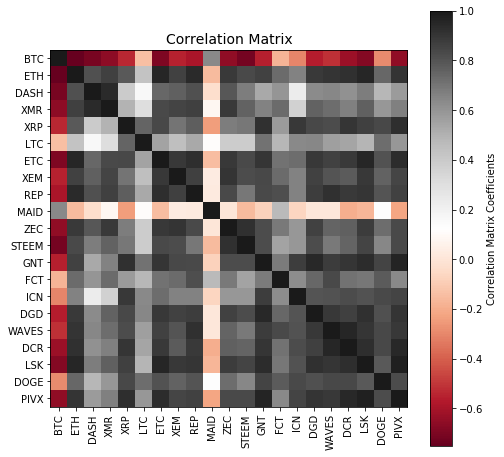
co = np.corrcoef(dfP.values.T) # correlation matrix
tickers = list(dfP.columns)
plt.figure(figsize=(8,8))
plt.imshow(co, cmap="RdGy", interpolation="nearest")
cb = plt.colorbar()
cb.set_label("Correlation Matrix Coefficients")
plt.title("Correlation Matrix", fontsize=14)
plt.xticks(np.arange(len(tickers)), tickers, rotation=90)
plt.yticks(np.arange(len(tickers)), tickers)
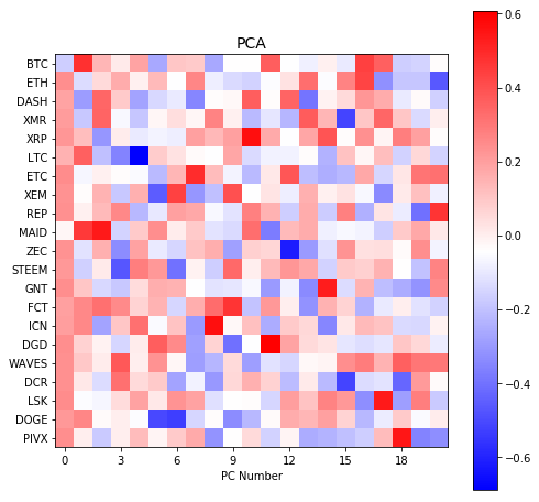
# perform PCA
w, v = np.linalg.eig(c)
ax = plt.figure(figsize=(8,8)).gca()
plt.imshow(v, cmap="bwr", interpolation="nearest")
cb = plt.colorbar()
plt.yticks(np.arange(len(tickers)), tickers)
plt.xlabel("PC Number")
plt.title("PCA", fontsize=14)
# force x-tickers to be displayed as integers (not floats)
ax.xaxis.set_major_locator(MaxNLocator(integer=True))
what generates correlation matrix:
and PC loadings (columns, $k=1,…,21$):
Now, let’s construct the bi-plot of relative weights of each cryptocurrency in the last two PC components (PC-20 and PC-21) arising from a PCA on a covariance matrix covering March 2017 full time period:
# choose PC-k numbers
k1 = -1  # the last PC column in 'v' PCA matrix
k2 = -2  # the second last PC column

# begin constructing bi-plot for PC(k1) and PC(k2)
# loadings
plt.figure(figsize=(7,7))
plt.grid()

# compute the distance from (0,0) point
dist = []
for i in range(v.shape[0]):
    x = v[i,k1]
    y = v[i,k2]
    plt.plot(x, y, '.k')
    plt.plot([0,x], [0,y], '-', color=grey)
    d = np.sqrt(x**2 + y**2)
    dist.append(d)
Having that, we need to identify those cryptocurrencies of the greatest loading. By the threshold I adopt the mean value of derived distances (see code) plus one standard deviation. Next, I check the membership of each coin to quarter number 1, 2, 3 or 4 saving that as tuples in a list of quar. Finally, I accomplish the task by finalising the plotting of a bi-plot by adding x and y labels, respectively:
# check and save membership of a coin to
# a quarter number 1, 2, 3 or 4 on the plane
quar = []
for i in range(v.shape[0]):
    x = v[i,k1]
    y = v[i,k2]
    d = np.sqrt(x**2 + y**2)
    if(d > np.mean(dist) + np.std(dist, ddof=1)):
        plt.plot(x, y, '.r', markersize=10)
        plt.plot([0,x], [0,y], '-', color=grey)
        if((x > 0) and (y > 0)):
            quar.append((i, 1))
        elif((x < 0) and (y > 0)):
            quar.append((i, 2))
        elif((x < 0) and (y < 0)):
            quar.append((i, 3))
        elif((x > 0) and (y < 0)):
            quar.append((i, 4))
        plt.text(x, y, tickers[i], color='k')

plt.xlabel("PC-" + str(len(tickers)+k1+1))
plt.ylabel("PC-" + str(len(tickers)+k2+1))
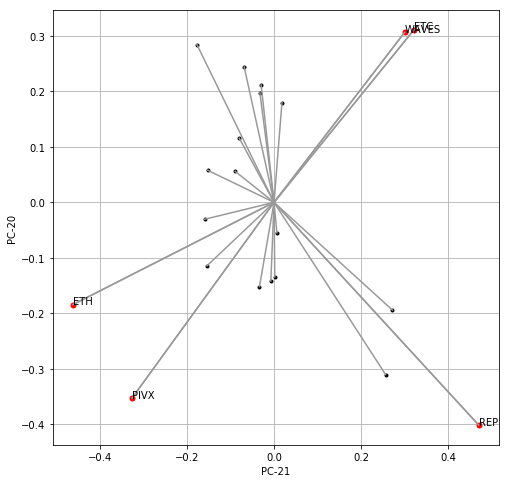
You would be surprised how easy is the interpretation of that plot. Those coins of “above the threshold” loading placed in quarter 1 might be highly correlated with those found in quarter 3. The same applied to quarter 2 vs quarter 4. In order to check that, let’s develop the last portion of code where we examine linear correlations for such pair of coins (cryptocurrency time-series) making use of two distinct tools, namely, one-factor linear regression (hence its $R^2$ metric) and Kendall’s rank correlation metric of $\tau$.
The following code aims at matching coins based on results visualised on bi-plot (red markers) along the logic stated above:
for i in range(len(quar)):
# Q1 vs Q3
if(quar[i][1] == 1):
for j in range(len(quar)):
if(quar[j][1] == 3):
plt.figure(figsize=(7,4))
# highly correlated coins according to the PC analysis
print(tickers[quar[i][0]], tickers[quar[j][0]])
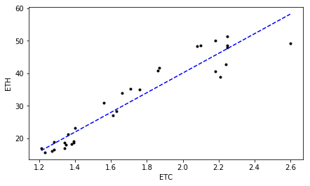
ts1 = dfP[tickers[quar[i][0]]] # time-series
ts2 = dfP[tickers[quar[j][0]]]
# correlation metrics and their p_values
slope, intercept, r2, pvalue, _ = stats.linregress(ts1, ts2)
ktau, kpvalue = stats.kendalltau(ts1, ts2)
print(r2, pvalue)
print(ktau, kpvalue)
plt.plot(ts1, ts2, '.k')
xline = np.linspace(np.min(ts1), np.max(ts1), 100)
yline = slope*xline + intercept
plt.plot(xline, yline,'--', color='b') # linear model fit
plt.xlabel(tickers[quar[i][0]])
plt.ylabel(tickers[quar[j][0]])
plt.show()
# Q2 vs Q4
if(quar[i][1] == 2):
for j in range(len(quar)):
if(quar[j][1] == 4):
plt.figure(figsize=(7,4))
print(tickers[quar[i][0]], tickers[quar[j][0]])
ts1 = dfP[tickers[quar[i][0]]]
ts2 = dfP[tickers[quar[j][0]]]
slope, intercept, r2, pvalue, _ = stats.linregress(ts1, ts2)
ktau, kpvalue = stats.kendalltau(ts1, ts2)
print(r2, pvalue)
print(ktau, kpvalue)
plt.plot(ts1, ts2, '.k')
xline = np.linspace(np.min(ts1), np.max(ts1), 100)
yline = slope*xline + intercept
plt.plot(xline, yline,'--', color='b')
plt.xlabel(tickers[quar[i][0]])
plt.ylabel(tickers[quar[j][0]])
plt.show()
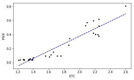
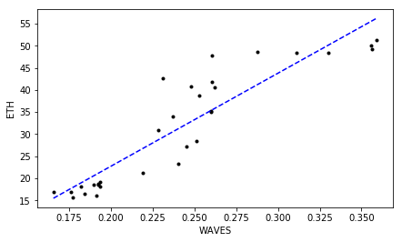
revealing highly correlated cryptocurrencies:
ETC ETH
0.953695467194 1.13545626686e-16  # R^2  p-value
0.840760907233 3.03600231596e-11  # tau  p-value
ETC PIVX
0.937915426073 7.20370581785e-15  # R^2  p-value
0.78875507792 4.55270029579e-10   # tau  p-value
WAVES ETH
0.909168786883 1.48631538239e-12  # R^2  p-value
0.81377872765 1.26296896563e-10   # tau  p-value
WAVES PIVX
0.894512813936 1.18055349284e-11  # R^2  p-value
0.753498821898 2.59829246278e-09  # tau  p-value
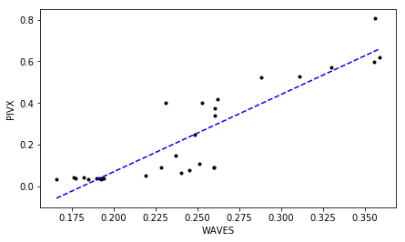
Much Ado About Nothing?
Looking at those plots representing correlated close prices for identified “highly correlated” cryptocurrencies can be a bit confusing for some of you. As we can see, indeed, a high degree in linear relationship is confirmed by $R^2 \gtrapprox 0.9$ at $\tau \gtrapprox 0.75$ for all of them. But isn’t easier just to scan the correlation matrix which we computed earlier, and pick up those cryptocurrency time-series displaying the greatest (lowest) correlation coefficients instead of running all these PC-based analyses?
Hmm, yes and no. Yes, because it is straightforward and not complicated. The correlation matrix reveals a number of coefficient pointing at strong linear correlation and anti-correlation. Therefore, how a PCA method influences “the same” results? This is due to the mathematical aspect of orthogonality that is being applied within a PCA itself. Namely, every single PC appears to be driven by/linked to different latent factor. As mentioned by Yang, Rea, & Rea (2015), so far, the majority of attention has been focused on first two or three PCA principal components (i.e. PC-1, PC-2, PC-3). The appealing interpretation has been connected to a common factor responsible for general market variability (PC-1) or some other synchronised fluctuations (PC-2, PC-3).
The outstanding variability detected among the very last PCs suggests other common factor/driver causing one or more cryptocurrencies to become highly correlated. Now, your homework is to take this tool down to the test and use it to your benefits!